Compare (Price Overlay)
The Basics
Used to track price changes of two or more items either on separate price axes or together on a percentage change vertical axis.
Indicator Type
Relative performance measure
Markets
All cash and futures, not options
Works Best
All market types and time frames.
Formula
The main chart does not have a formula, but the optional correlation pane shows how each item compares to the main item using a correlation coefficient. The result varies between -1 (trades exactly the opposite) and +1 (trades the same).
Parameters

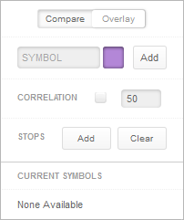
Compare draws each item fixed together at the left side of the chart. This will move as the chart is scrolled backwards and forwards in time.
Overlay is a simple price overlay where each item is drawn on its own price axis to fill the chart.
The user can select the box to turn on correlation that will draw below the main chart. Also choose the look back period for the calculation.
You can also select colour for the plots by selecting the boxes to bring up a colour palette for each added symbol.
The stops add button is used only with the compare feature to allow the user to fix the chart to a specific period. Moving the chart backwards and forwards will hold that fixed time in place.
Theory
Comparing two items together on one chart using the overlay feature allows the user to see how two stocks or currencies track together over time. It is easy to spot when the move together and when they move apart and determine if they are positively, or negatively correlated. If positively correlated, when they diverge it could be a trading opportunity. Conversely, if they are typically negatively correlated then when they track together there also could be an opportunity – or a warning!
Using the compare feature sets one or more items to start at 0% and we can then see how they move apart and together over time. This is great for comparing many sectors of the stock market together.
Interpretation
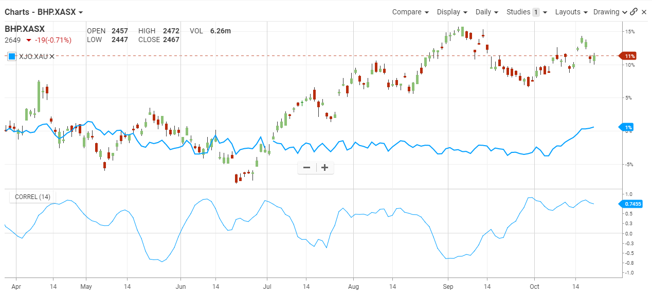
The interpretation of the compare feature is relatively simple. The first chart shows the BHP and the XJO plotted together. A 14-day correlation was added to show that most of the time these two instruments are negatively correlated and tend to move in opposite directions.

The beauty of the correlation feature is that it proves what we think we already knew about the relationship. As we can see, most of the time in 2014 the correlation plot is above zero. However, it does reach the zero level on three occasions.
Visually, we can see the usually relationship as the two price plots are mostly inverse versions of each other.

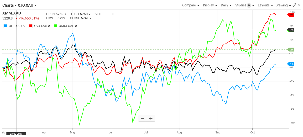
In the second chart, we see how three sectors in the stock market performed over time. Finance, small ords and metal – traditionally expected to move together – did indeed track together in mid 2017. However, finance started to weaken relative to the other two.
Math

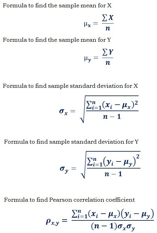
Correlation Coefficient is used in statistics to calculate the strength and direction of the linear relationship or the statistical relationship (correlation) between two data sets. For charting, it is between two traded instruments and the result is recalculated for each period in the same was as a moving average “moves” through time using fresh data.
In the formula, the symbols μx and μyrepresents the mean of the two data sets X and Y respectively. The σx and σy represents the sample standard deviation of the two data sets X and Y respectively.
Step by Step Calculation
1) Find the sample mean μx for data set X.
2) Find the sample mean μy for data set Y.
3) Estimate the standard deviation σxfor sample data set X.
4) Estimate the sample deviation σyfor data set Y.
5) Find the covariance (cov(x, y)) for the data sets X and Y.
6) Apply the values in the formula for correlation coefficient to get the result.
The value ranges between -1 to +1. The positive and negative correlation coefficient represents the direct (positive) and inverse (negative) linear correlation or statistical relationship between the data sets. If it is close to zero or equal to zero, then the data sets have no correlation (uncorrelated). If the value is between -1 to +1 then there is the linear correlation between the two data sets.
